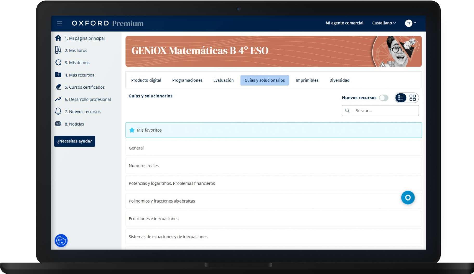
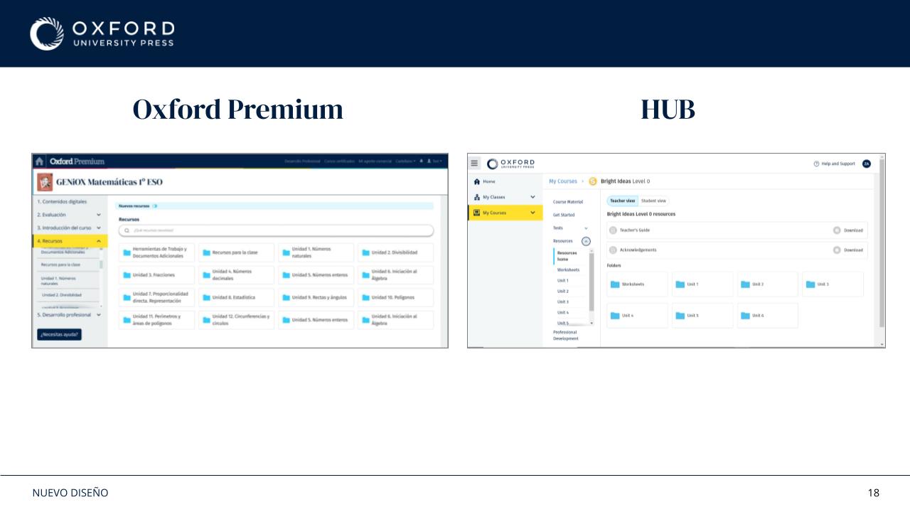
Oxford Premium had grown without a shared design language. Different areas of the product had started to drift apart, while the platform also needed to move closer to Oxford's UK platform, HUB.
As the sole UX/UI Designer, I connected platform research, interaction design, visual direction, component foundations and implementation support.
Role
Sole UX/UI Designer
Timeline
11 months
Scope
Research to implementation support
The system in context: navigation, content tabs and resource controls.
The decisions
Three choices that shaped the system
01
Start with the ecosystem
I mapped the platform, its flows and its relationship with HUB before defining shared patterns.
02
Build patterns, not one-off screens
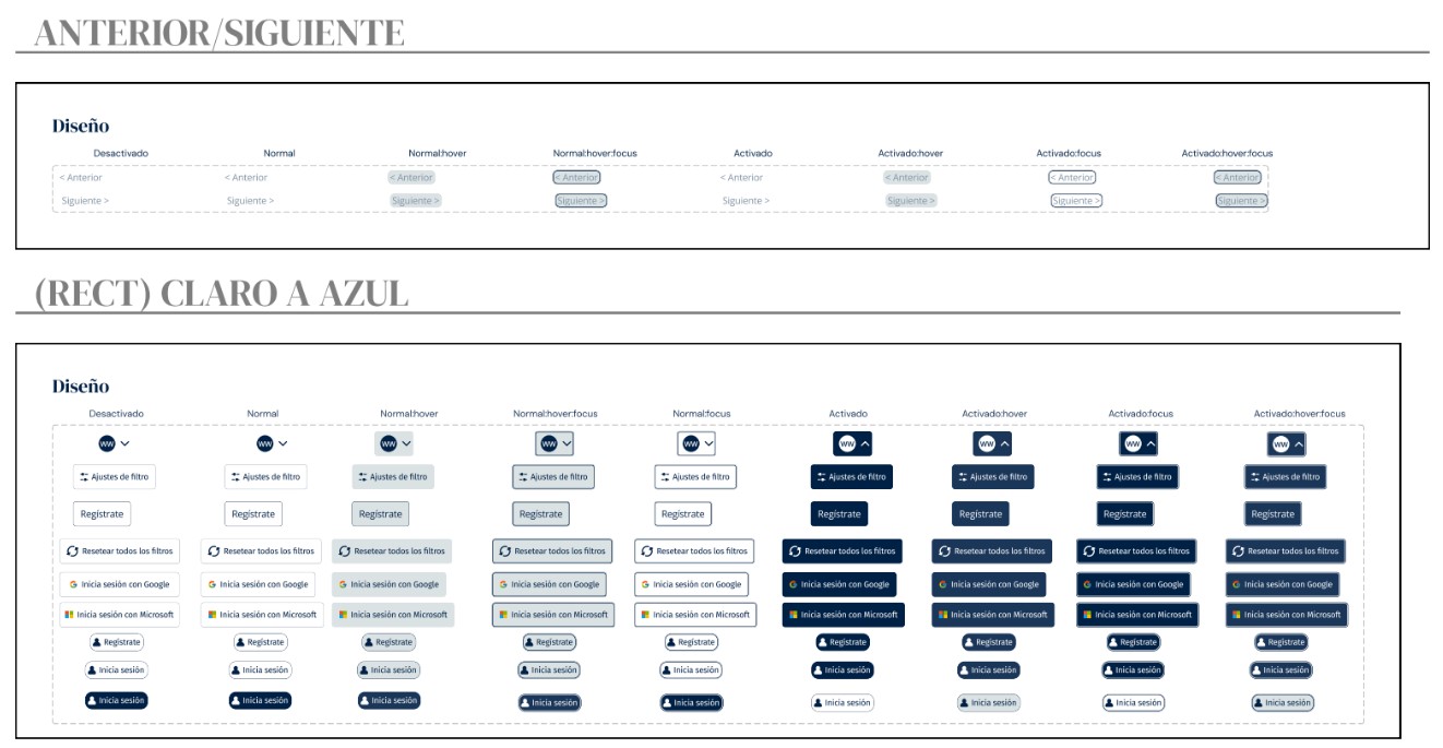
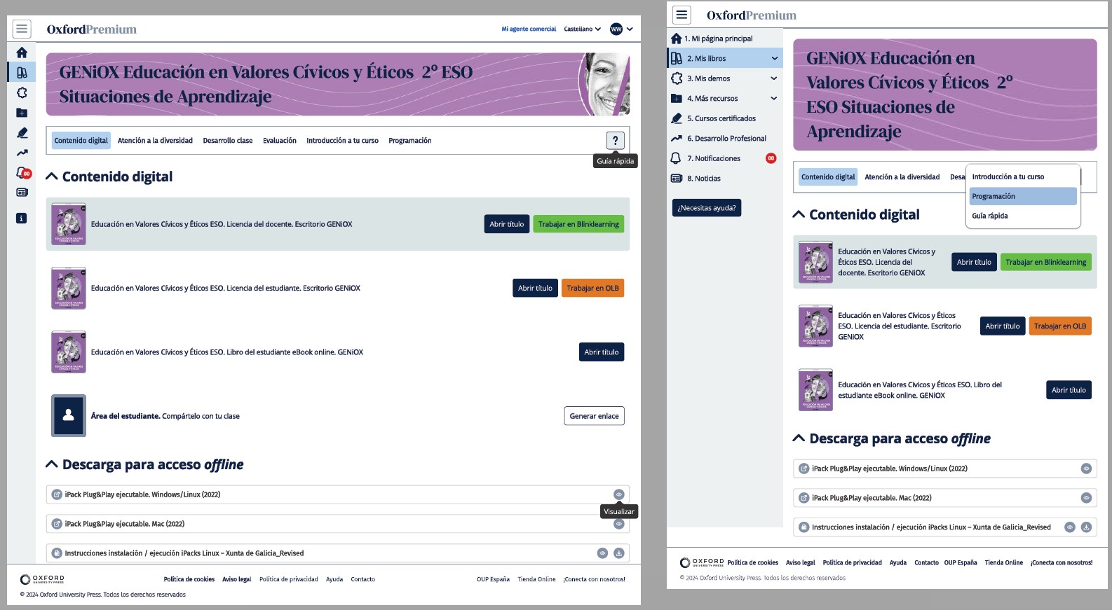
I defined foundations for typography, colour, spacing, components, states and responsive behaviour.
03
Design with implementation
I documented behaviour and worked with development so the system could be introduced progressively.
Evidence
From shared foundations to real product flows
The work was not just a component library. It connected visual alignment, interaction patterns and implementation decisions across the platform.
Aligning Oxford Premium with HUB while keeping the local product's needs visible.Documenting states so components behaved consistently across the interface.Applying the same system across different product views and resource flows.
Video description: From the Oxford Premium landing page, the user opens the sign-in screen. A white form beside a blue circular illustration offers Google, Microsoft and email sign-in. The user enters an email address and a masked password, then selects Sign in. The demo homepage appears, with sample books and news cards.
Live evidence · 01
Entry point
The login flow uses the same visual foundations and interaction conventions as the rest of the platform.
Video description: On the Oxford Premium demo homepage, the user opens the account menu and selects Edit account. A white panel slides in from the right, dimming the homepage behind it. The panel contains email and password options, Google and Microsoft account linking, the current school, name fields and an optional contact phone number. Scrolling reveals Cancel and Save changes. The user then selects Change school, opening a panel with a postcode search and a school selector. No profile changes are saved in the recording.
Live evidence · 02
Account settings
The component library helped replace patterns that had drifted apart across different areas of the product.
Video description: On the Oxford Premium demo homepage, the user selects My sales representative in the top bar. A small centred pop-up appears over the dimmed page. It combines a profile photo, the representative’s name and contact details, rounded corners and orange decorative shapes. Identifying details are obscured in the recording. The user closes the pop-up with the cross in its top-right corner, returning to the homepage.
Business constraint · 03
Adapting a commercial request
The Commercial team requested a pop-up with a very specific design and format. Working within that constraint, I adapted the UI as far as possible to the existing system so it remained coherent with the rest of Oxford Premium.
Outcome
A shared source of truth
Design system foundations covering typography, colour, spacing, components and states.
Redesigned interaction flows with closer alignment to Oxford's UK platform, HUB.
Clearer documentation and handoff for progressive implementation with development.
Responsive behaviour and accessibility considered as part of the system.
🔒 About the examples
The clips show Oxford Premium's demo account. No real school or customer data is included. Internal process material is kept in the Deep Dive case study in adapted form.